


Twenty years after Miranda Priestly’s iconic monologue in The Devil Wears Prada, cerulean blue is making a major comeback. On both fashion runways and in our interiors, this sophisticated, history-rich shade is once again becoming the obsession of the moment.
Twenty years later, the scene still sends fashion lovers into a frenzy. In The Devil Wears Prada, Miranda Priestly — the imperious editor-in-chief played by Meryl Streep — subtly humiliates Andrea, her young assistant still unfamiliar with the codes of fashion, after she dares to laugh at the choice between “two blue belts.” That’s when the now-legendary monologue about cerulean blue begins. “This blue represents millions of dollars and countless jobs,” Miranda explains before tracing the entire fashion chain, from haute couture runways to discount store racks, to prove that Andrea did not “choose” her blue sweater — the industry chose it for her.
The famous line? “That blue represents millions of dollars and countless jobs… It’s not turquoise. It’s not lapis. It’s actually cerulean.” A masterclass on fashion’s cultural influence that has become one of the most iconic dialogues in contemporary cinema, even though many of Miranda’s references were imprecise — or entirely invented.
And in what feels like the perfect nod to a scene that went viral long before TikTok existed, cerulean blue is now making a major comeback, fueled by the highly anticipated release of The Devil Wears Prada 2, twenty years after the original film. The shade is already reappearing in wardrobes as well as interiors. More than just a color, cerulean has once again become a symbol — one of discreet luxury, emotion and almost nostalgic sophistication.
A Fashion Trend… That Is Also Taking Over Interiors
This season, the runways confirmed the trend. Cerulean blue appeared across several Spring/Summer 2026 ready-to-wear collections, seen at houses such as Prada, Tory Burch, Fendi, Loewe and Versace. Some embraced it through ultra-sleek monochromatic silhouettes, while others used vibrant cerulean accessories to energize minimalist looks.
The return of blue is no coincidence. After several seasons dominated by neutral tones, designers seem eager to reintroduce emotion and freshness into fashion. Cerulean has that rare ability to feel both luminous and calming — sophisticated without being intimidating. It evokes summer skies, Mediterranean pools, Italian ceramic tiles and even early-2000s fashion archives.
But the trend extends far beyond clothing. In a report shared by Etsy, the platform highlights renewed interest in the shade within the world of interior design.

“We’re seeing consumers reconnect with colors that carry cultural meaning. Cerulean blue embodies the translation of niche culture into deeply personal expression. And that’s exactly how people are incorporating it into their style, whether through bold fashion choices or subtle design accents in their homes,” explains Dayna Isom Johnson, Etsy’s trend expert.
Throughout the report, cerulean appears on velvety blue leather bags, hand-blown glassware, abstract wall art and artisanal tableware exploring different variations of the shade. In interiors, the color is often used sparingly to instantly add depth and sophistication to neutral or classic spaces.
The Surprisingly Complex History Behind Cerulean Blue
Behind its elegance lies an unexpectedly complex scientific story. Cerulean blue was one of the most difficult pigments to develop in the history of color. Its name comes from the Latin caeruleum, meaning sky or sea. As early as Antiquity, Egyptians attempted to create luminous blues using mixtures of silica, copper and calcium. But these pigments remained unstable and difficult to reproduce. For centuries, artists relied on rare and expensive alternatives such as ultramarine, made from lapis lazuli imported from Afghanistan.

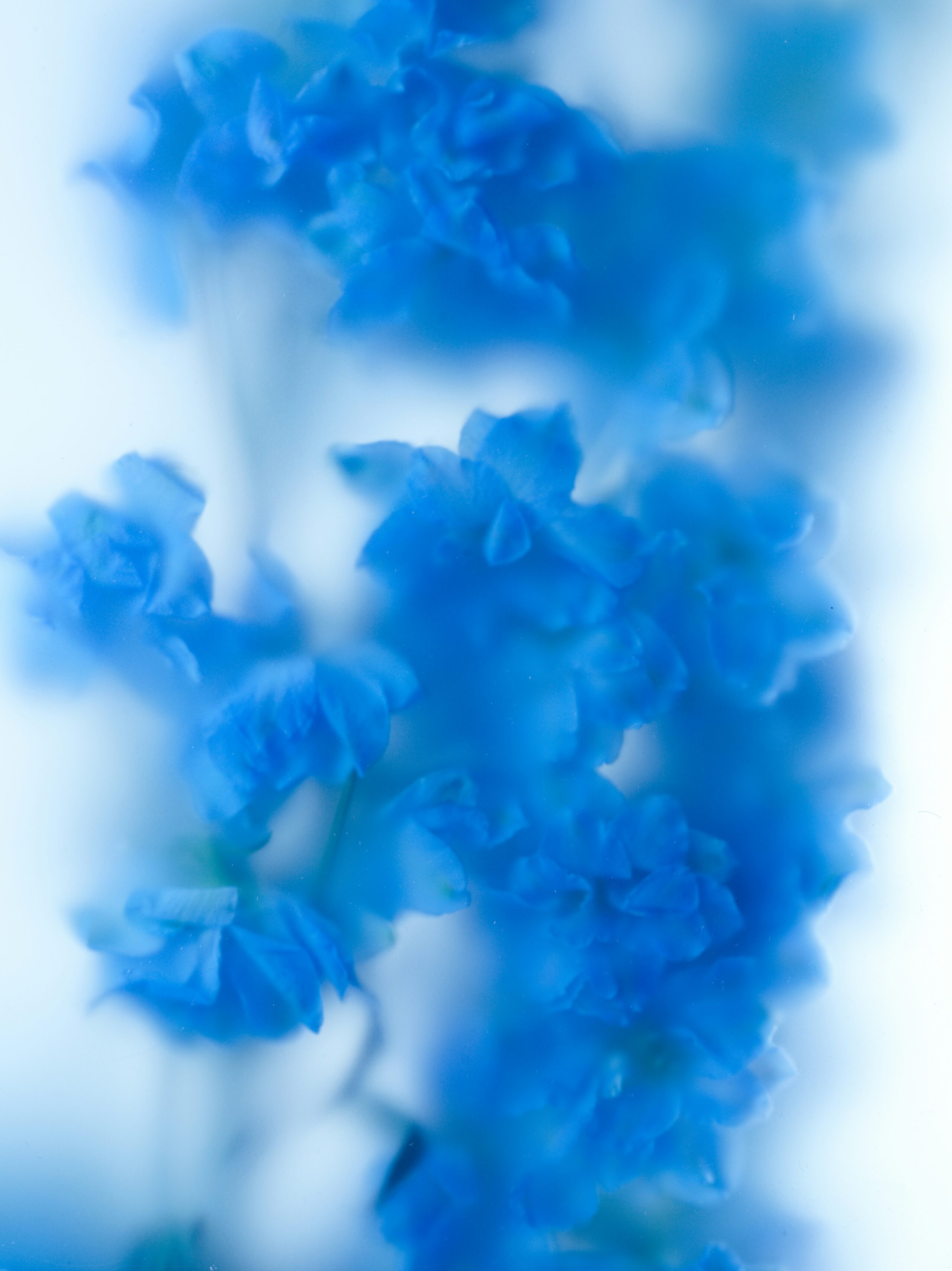
Modern cerulean blue only truly emerged in the 19th century thanks to advances in industrial chemistry. The pigment was officially developed using cobalt and tin compounds — a particularly delicate combination to stabilize. Its production required extremely precise temperatures: even the slightest variation could completely alter the final shade. That complexity made cerulean both difficult and costly to produce. Unlike more saturated blues, cerulean has a slightly milky, misty undertone that gives it its characteristic depth.
Painters quickly embraced it. Impressionists, fascinated by natural light variations, used cerulean to depict skies and water reflections with greater realism. Claude Monet and Berthe Morisot especially appreciated its stability and its ability to capture luminous atmospheres. While many blue pigments darkened or faded over time, cerulean retained its freshness.
It is also this almost powdery softness that distinguishes cerulean today from more electric or saturated blues such as Klein blue. Where Klein blue asserts radical intensity, cerulean speaks the language of subtlety, nuance and quiet sophistication.
Read also : 10 adresses pour vivre Milan et ses environs comme dans Le Diable s’habille en Prada 2
Featured photo : Unplash