


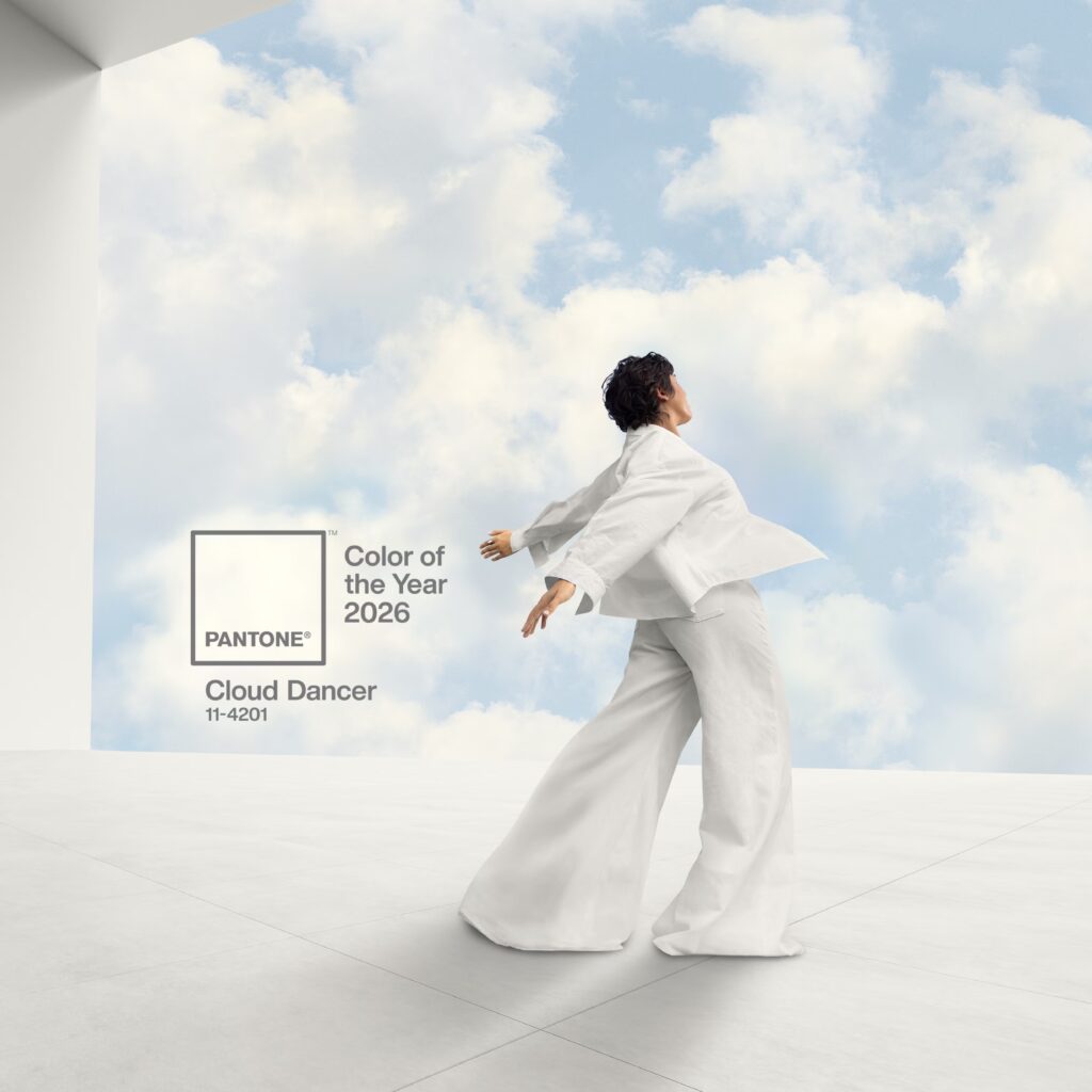
Mocha Mousse, Peach Fuzz and Viva Magenta… Pantone has unveiled the 2026 Color of the Year: Cloud Dancer, a delicate and refined shade of white. The hue did not win unanimous approval, beyond its apparent simplicity.
Each year since 1999, Pantone, a company founded in the United States in the 1960s and known for its Pantone Matching System made up of several thousand colors, reveals the ultimate trend shade. A color we are expected to be seen everywhere, one that could inspire all artistic fields—from design and decoration to fashion and lifestyle in general. Inspiring and popular, this shade is also meant to reflect the overall mood of the coming year, whether soft, joyful or understated.
In 2025, Pantone highlighted Mocha Mousse, a warm brown that embodies a sensory refuge. The previous edition celebrated Peach Fuzz, a soft shade between pink and orange, evoking the velvety peach. In a period of uncertainty, it symbolized tenderness, kindness and togetherness. In 2023, Pantone celebrated Viva Magenta, a bold, joyful and stimulating carmine red representing the “new world” after COVID.
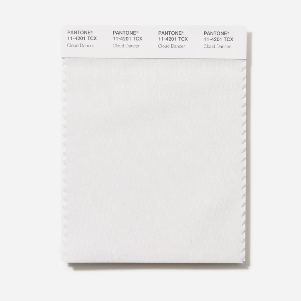
While all these recent colors evoke specific themes tied to their time – along with evocative emotions—the 2026 shade has not convinced the public. Pantone has chosen Cloud Dancer, a soft, pure and slightly felted white, somewhere between classic white and a subtly creamy white.
Political controversy
It is the first time the American company has chosen a white as Color of the Year. Pantone 11-4201, the shade’s code, is associated with ideas of purity, letting go of the superfluous and a neutrality linked to the pursuit of balance. It suggests the need to create visually calm and soothing spaces, and represents a blank page, a fresh start.
“Pantone 11-4201 Cloud Dancer symbolizes a soothing influence in a society rediscovering the value of quiet reflection. A bubbling white imbued with serenity, it invites relaxation and true focus, allowing the mind to wander and creativity to breathe,” the company explains on Instagram.
Shortly after its presentation on December 5, the color attracted harsh criticism from part of the public. Many people were not inspired by the shade, even preferring Ikea’s Rebel Pink, a bright pale pink. Many reacted on social media by mocking the fact that it was simply… white. Some even concluded that Cloud Dancer was not a color at all.
“The fact that the Color of the Year is colorless is a sign of recession”; “At a time when color is used to express culture, diversity, emotion and innovation, choosing a white-based shade feels, at best, disconnected”; “Also the color of abandonment”; “Pantone’s worst choice, so boring”… On social platforms, users didn’t hesitate to criticize the blandness of the shade and what it represents.
But the outrage didn’t stop there. The debates became political and societal. “White is the essence of neutrality. But in a year when white nationalism is among the dominant news topics, this choice is surprising,” wrote a Washington Post journalist.
Some comments pointed out that whiteness carries historical symbolic weight, often associated with white supremacy and racial inequality. Others argued that this kind of choice resonates with a visual universe favored by wealthy and privileged circles, where minimalism is associated with sophistication and discreet wealth, reminiscent of Quiet Luxury.
Pantone defends itself
Faced with the controversy, Pantone quickly reacted to defend its color and explain its choice. In an article in The Washington Post, Laurie Pressman, vice president of the Pantone Color Institute, rejected the idea that the institute was alluding to a particular skin tone—an accusation she seems to face every year.
“For Peach Fuzz (the 2024 Color of the Year), just like for Mocha Mousse (the 2025 Color of the Year), we were already asked if it had something to do with skin tones. We were stunned,” she told Le Parisien.
According to her, and still in the magazine’s columns, Cloud Dancer is a “structural color that goes with everything. White is the base that allows other colors to fully reveal themselves.” Pantone also confirmed that the institute does not associate a color with a political vision. Colors remain, essentially, colors.
Leatrice Eiseman, executive director of the Pantone Color Institute, added that the shade represents a “blank canvas that opens new paths and new ways of thinking,” like a “whisper of calm in a noisy world.”
On its website, Pantone has nonetheless published pairing suggestions to integrate Cloud Dancer into daily life. With powdery pastels, vivid and warm shades, blues, greys and purples evoking aquatic or atmospheric worlds, organic and natural palettes (beiges, browns and oranges), tropical tones, contrasts between light and shadow, and opposite tones such as the glamour of red and the depth of black… The advantage of this off-white is its ease of pairing with other colors, offering an unparalleled field for expression.
Read also : Fashion Trend: The Military Jacket in Napoleonic Style Makes Its Comeback in Wardrobes
Featured photo : Pantone